<body><script type="text/javascript"> function setAttributeOnload(object, attribute, val) { if(window.addEventListener) { window.addEventListener('load', function(){ object[attribute] = val; }, false); } else { window.attachEvent('onload', function(){ object[attribute] = val; }); } } </script> <div id="navbar-iframe-container"></div> <script type="text/javascript" src="https://apis.google.com/js/platform.js"></script> <script type="text/javascript"> gapi.load("gapi.iframes:gapi.iframes.style.bubble", function() { if (gapi.iframes && gapi.iframes.getContext) { gapi.iframes.getContext().openChild({ url: 'https://www.blogger.com/navbar/822454308284193003?origin\x3dhttp://nitrographics.blogspot.com', where: document.getElementById("navbar-iframe-container"), id: "navbar-iframe" }); } }); </script>
welcome
Oh man!
Look at those cavemen go
It's the freakiest show
Take a look at the Lawman
Beating up the wrong guy
Oh man! Wonder if he'll ever know
He's in the best selling show
Is there life on Mars?

profile
Hi my name is larissa and I like tacos ;33.
bold, italic, underline


tagboard
tagboard.

links
Link, Link, Link, Link, Link, Link, Link, Link.

credits
infravermelho
The essay.
Wednesday, November 4, 2009, 11:07 AM
Larissa Williams

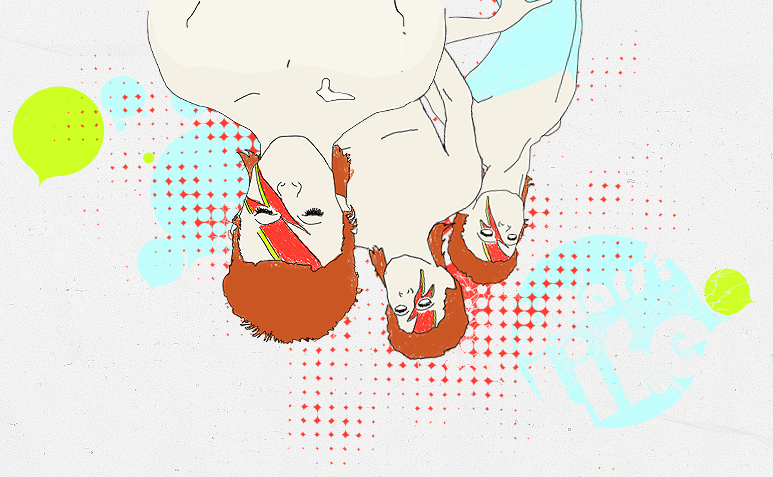
I like to think my design makes a statement about bcc. It's just a silly face and super contrasted colours and design. I wanted to show that bcc isn't just about study and hard-work, it's also about enjoying life as well. I know I made it off to a side, so her face isn't right there in the middle. It makes it seem more dramatic. Her face is the emphasis for sure, contrast is in the colours I used. Balance comes in with the black broader and the general catalog in the upper right hand side. It flows together I'd say. though you can tell that the Bcc logo is the real logo. In my design it's all bout colour. I wanted people to notice my design right off the bat, I want it to be stuck in your mind when you see it. It's quite a big theme in my design.