Monday, December 14, 2009, 11:17 AM
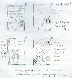
This is my final version of my Hello Kitty history poster. I wanted the viewer to have the same feel looking at it as if looking at a really cute puppy. Hello Kitty just gives off the really cute vibe, and in this poster I deff wanted people to get that feel. I put in all the important information about her or that people didn't know about her. Really I was surprised what I found out, that I really didn't even know. I wanted to make it simple, because when you see hk she only has a bow and face. But as I designed it was to simple, so I added the little red bows for the replaced bulletins. Also a cute kinda un-seeen background and after first round critique I added a thin red boarder with her signature red bows at the four corners. I really worked hard on this to make it as cute as possible, just like Hello Kitty herself. Balance in how I used her name and face to put wight on each end of the page. Her bows are also equal in visual weight. With the background it was a bit of depth and visual space it just makes the whole piece just flow.
Monday, December 7, 2009, 12:46 PM

Wednesday, December 2, 2009, 12:43 PM

, 12:43 PM

, 12:41 PM


, 12:29 PM


Wednesday, November 4, 2009, 12:21 PM

, 11:07 AM
Larissa Williams
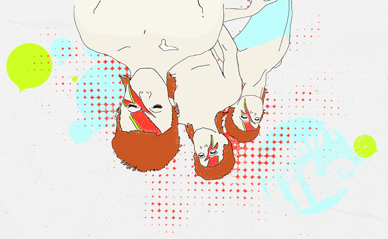
I like to think my design makes a statement about bcc. It's just a silly face and super contrasted colours and design. I wanted to show that bcc isn't just about study and hard-work, it's also about enjoying life as well. I know I made it off to a side, so her face isn't right there in the middle. It makes it seem more dramatic. Her face is the emphasis for sure, contrast is in the colours I used. Balance comes in with the black broader and the general catalog in the upper right hand side. It flows together I'd say. though you can tell that the Bcc logo is the real logo. In my design it's all bout colour. I wanted people to notice my design right off the bat, I want it to be stuck in your mind when you see it. It's quite a big theme in my design.
Monday, November 2, 2009, 10:16 AM


Wednesday, October 28, 2009, 12:28 PM

Monday, October 5, 2009, 12:41 PM

Wednesday, September 23, 2009, 12:10 PM

, 12:09 PM

, 12:07 PM

, 12:07 PM

, 12:03 PM

, 12:01 PM

, 11:59 AM

Monday, September 21, 2009, 12:35 PM

In this final design of the typographical design, I wanted the viewer to feel like it's pirate writing. However, it really has a real clean feel to it. I used the counter-forms to balance out the design. It deff has flow and colour to it. Though I did have a difficult time with choosing the letters and putting where they would look good. Other then that I'd say it came out to be a good final.
Wednesday, September 2, 2009, 12:30 PM